
Safety signage is an important mode of communication adopted by organisations all over the world and it doesn’t matter what language is used to support the imagery, signs or symbols displayed in public placesbecause they are universally understood for what they mean regardless of language support. There are set images and a certain layout that is followed by all safety signs to make sure they are understood by everyone. This is particularly true for safety signs within the workplace as they are designed to help ensure safety and deliver important instructions in case of an emergency.
Colour plays an important role in ensuring safety signs are easily and instantly recognizable.It is also imperative that each colour used communicates the same thing every time to everyone no matter where it is displayed. For instance, red is used to signify danger or unsuitable behaviour in that location. You can read more about why getting the colour right for your safety signage is important. The use of images in combination with the correct colour becomes a powerful form of messaging independent of language.

Safety signs have several different uses and applications, they are to:
- Draw attention to health and safety concerns and hazards
- Provide general information and directions
- Instruct and/or remind employees of personal protective equipment or hygiene practices
- Indicate the location of emergency equipment
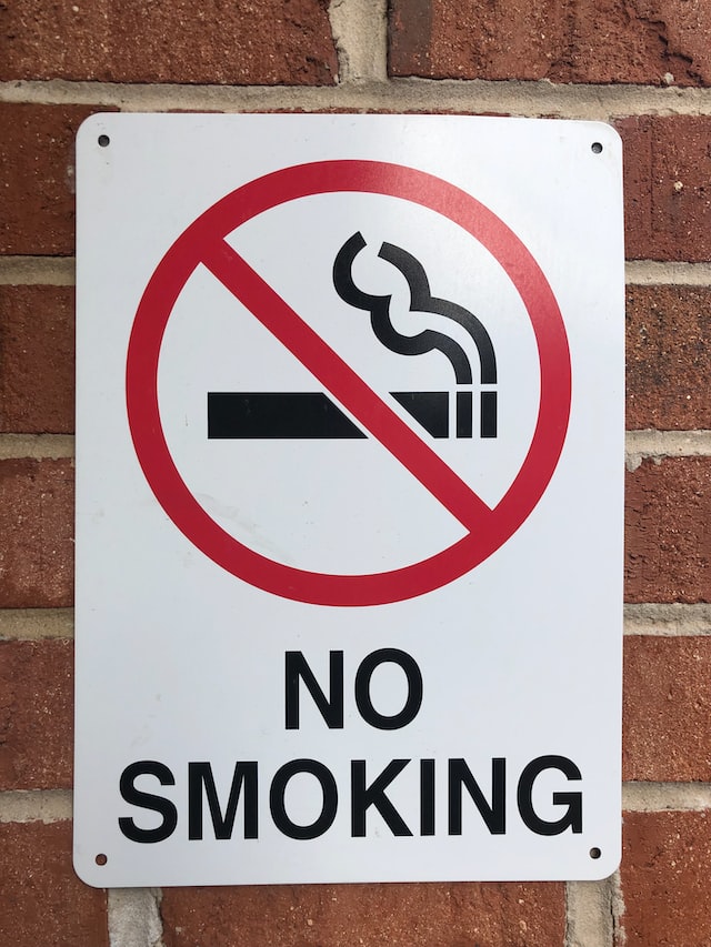
- Inform which actions are prohibited or mandatory
The psychology of colour and the meanings associated with colour play an important role in the success of safety signs. Every colour has its own set of connotations and evokes a different response from individuals. For example, red demands attention.
Colours and their meanings.
Red:red signage is usually used to communicate danger or to give instructions about preventing dangerous behaviour. Safety signs that use red should cover at least 35% of the signage. Signs are usually round, have a red edge with black images or text, and are printed on a white background.
Yellow /Amber: yellow is typically used to provide useful information. Examples are cautionary instructions such as ‘caution’ and safety warnings like ‘slippery floor’. Signs are usually triangular and typically have black images or text printed on a yellow background. At least 50% of the signage has to be in yellow to be effective.
Blue: used to show instructions that are obligatory and must be followed. Although it is a softer colour it is eye-catching enough to emphasise its importance. Signs are typically round and contain white images or text on a blue background. Blue should be at least 50% of the signage.
Green: used to inform people and draw attention to a situation or setting. Used for exit signs and first aid signs it is easily recognizable. Green signs are typically square or rectangular and have white images or text on a green background. Green should be at least 50% of the signage.
Recent Comments